Akira: Icon Design
The process of designing the logo for an autonomous snow removal solution.
This is part of a larger project on designing a mobile app for an autonomous snow removal solution called Akira. If you're interested you can read more about the project and the process of developing personas for the system or the development of the app interface.
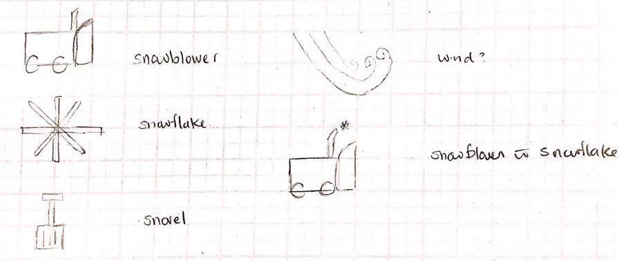
Initial Sketches
I first sketched out some initial designs on paper, shown below. I wanted to clearly convey the functionality of the app through the icon design, so users would be able to quickly identify the system from their home screen.
Colour
For the colour, as I mentioned in the interface development, I chose to use blue as the base colour because it is a cool colour, which matches the feel of snow and ice. Using Paletton, a colour palette development tool, I developed an number of abstract mood boards, shown below and surveyed users to see which colour scheme was the most popular.

In the end, a monochromatic blue colour scheme was identified as the most popular colour scheme.

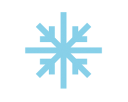
Finished Icon
The final step was to generate a digital version of the icons. I decided to go with a flat icon design, because a skeuomorphic design would require details that would be lost at the small scale required for an icon. The snowflake best conveys the purpose of the project and so I chose to develop the icon into a digital version using Sketch.